 Code the web
May 06 2017 | Foundations
Responsive CSS grids explained: Creating a grid from scratch
CSS Grids can seem complex but don't have to be. In this post we will build a responsive grid with breakpoints and then tidy it up with SASS.
We are going to be creating this CSS grid (codepen example).
See the Pen Responsive CSS grids explained: Creating a grid from scratch by codetheweb (@codetheweb-com) on CodePen.
Why we use grids
We use grids to layout elements on a web page. With a few lines of code, we aim to create a set of reusable styles that can handle most of our layout needs for an entire site.
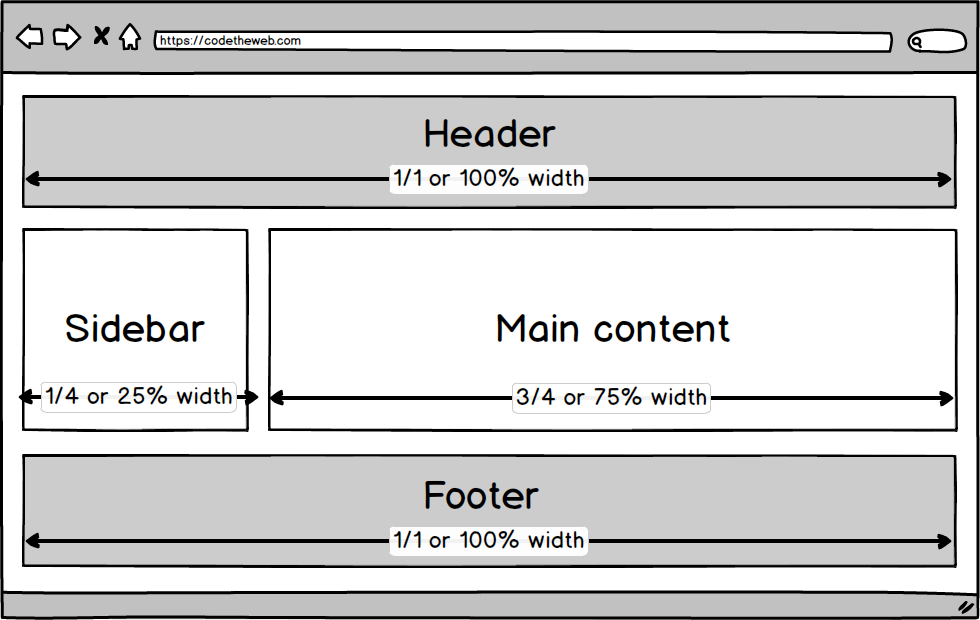
Let’s take a simple example: A page with a header, sidebar and main content area.
We could write the following:
#header {
    width: 100%;
    float: left;
}
#main {
    width: 75%;
    float: left;
}
#sidebar {
    width: 25%;
    float: left;
}
#footer {
    width: 100%;
    float: left;
}
But this CSS does not scale very well. What happens if we want to introduce a sidebar on the right-hand side or a different layout on other pages.
More efficient to write the following:
/* Styles shared across all columns */
[class^="col-"]{
    float: left;
}
/* One whole */
.col-1-1 {
    width: 100%;
}
/* One quarter */
.col-1-4 {
    width: 25%;
}
/* Three quarters */
.col-3-4 {
    width: 75%;
}
Now we have a reusable set of classes to apply column widths to elements on our page.
Spacing between columns
We need to set the correct box-sizing for the browser. Paul Irish explained it best here.
We then can add gutters (i.e. space) between the columns and clear our floats with a clearfix. Let’s create a class to wrap all our columns in called .grid.
/* apply box layout model to all elements */
html {
    box-sizing: border-box;
}
*, *:before, *:after {
    box-sizing: inherit;
}
/* Our grid class */
.grid {
    margin-left: -10px; /* Offset the gutter of the columns */
}
.grid:after { /* Clearfix */
    content: "";
    display: table;
    clear: both;
}
[class^="col-"] {
    padding-left: 10px; /* Column gutter */
    float: left;
}
Here’s our HTML implementation. We’ve now created our basic grid system!
<div class="grid">
    <div class="col-1-1">
        Header
    </div>
    <div class="col-1-4">
        Sidebar
    </div>
    <div class="col-3-4">
        Content
    </div>
    <div class="col-1-1">
        Footer
    </div>
</div>
Adding more column widths
We can now easily add more column widths depending on what we need.
/* One half */
.col-1-2 {
    width: 50%;
}
/* One third */
.col-1-3 {
    width: 33.3333%;
}
/* Two thirds */
.col-2-3 {
    width: 66.6666%;
}
Thinking about smaller screens
We want our grid columns to adapt and change width depending on screen size. Wouldn’t it be nice to combine the class names so we can declare different column widths at different screen sizes:
<div class="col-1-1 col-1-2-md col-1-4-lg">
    <!--
    * One whole by default,
    * One half on medium screens(md)
    * One quarter on large screens(lg)
     -->
</div>
A mobile first approach
We’re going to build the CSS for the example above. We’re taking a mobile first approach. That means we declare the column width for small screens first and then with @media queries write CSS that only affects medium/large screens and up. At our chosen breakpoints (screen widths) we add a modifier -md and -lg to the class name for medium and large.
.col-1-4 {
    width: 25%;
}
/* One quarter width above 768px () */
@media (min-width: 768px) {
    .col-1-4-md {
        width: 25%;
    }
}
/* One quarter width above 960px */
@media (min-width: 960px) {
    .col-1-4-lg {
        width: 25%;
    }
}
<div class="grid">
    <div class="col-1-1">
        Header
    </div>
    <div class="col-1-1 col-1-4-lg">
        Sidebar
    </div>
    <div class="col-1-1 col-3-4-lg">
        Content
    </div>
    <div class="col-1-1">
        Footer
    </div>
</div>
We have now created a responsive grid!
Adding more breakpoints
Like column widths, we can add as many breakpoints as we need:
/* One quarter width above 320px () */
@media (min-width: 320px) {
    .col-1-4-xs {
        width: 25%;
    }
}
/* One quarter width above 380px */
@media (min-width: 480px) {
    .col-1-4-sm {
        width: 25%;
    }
}
Bringin it all together
Here’s our final CSS grid:
/**
 * Box sizing setup
 */
html {
    box-sizing: border-box;
}

*, *:before, *:after {
    box-sizing: inherit;
}

/**
 * Grid
 */
.grid {
    margin-left: -10px;
}
.grid:after {
    content: "";
    display: table;
    clear: both;
}
[class^="col-"] {
    padding-left: 10px;
    float: left;
}
.col-1-1 {
    width: 100%;
}
.col-1-2 {
    width: 50%;
}
.col-1-3 {
    width: 33.33333%;
}
.col-1-4 {
    width: 25%;
}
.col-2-3 {
    width: 66.66666%;
}
.col-3-4 {
    width: 75%;
}

@media (min-width: 320px) {
    .col-1-1-xs {
        width: 100%;
    }
    .col-1-2-xs {
        width: 50%;
    }
    .col-1-3-xs {
        width: 33.33333%;
    }
    .col-1-4-xs {
        width: 25%;
    }
    .col-2-3-xs {
        width: 66.66666%;
    }
    .col-3-4-xs {
        width: 75%;
    }
}
@media (min-width: 480px) {
    .col-1-1-sm {
        width: 100%;
    }
    .col-1-2-sm {
        width: 50%;
    }
    .col-1-3-sm {
        width: 33.33333%;
    }
    .col-1-4-sm {
        width: 25%;
    }
    .col-2-3-sm {
        width: 66.66666%;
    }
    .col-3-4-sm {
        width: 75%;
    }
}
@media (min-width: 768px) {
    .col-1-1-md {
        width: 100%;
    }
    .col-1-2-md {
        width: 50%;
    }
    .col-1-3-md {
        width: 33.33333%;
    }
    .col-1-4-md {
        width: 25%;
    }
    .col-2-3-md {
        width: 66.66666%;
    }
    .col-3-4-md {
        width: 75%;
    }
}
@media (min-width: 960px) {
    .col-1-1-lg {
        width: 100%;
    }
    .col-1-2-lg {
        width: 50%;
    }
    .col-1-3-lg {
        width: 33.33333%;
    }
    .col-1-4-lg {
        width: 25%;
    }
    .col-2-3-lg {
        width: 66.66666%;
    }
    .col-3-4-lg {
        width: 75%;
    }
}
Simplify with SASS
Writing a column width for each breakpoint is annoying. This @mixin solves our problems. We @include it once by itself and then in each breakpoint adding the relevant modifier e.g. @include grid-setup('-xs');
// Grid mixin
@mixin grid-setup($namespace: ""){
    .col-1-1#{$namespace} {
        width: 100%;
    }
    .col-1-2#{$namespace} {
        width: 50%;
    }
    .col-1-3#{$namespace} {
        width: 33.33333%;
    }
    .col-1-4#{$namespace} {
        width: 25%;
    }
    .col-2-3#{$namespace} {
        width: 66.66666%;
    }
    .col-3-4#{$namespace} {
        width: 75%;
    }
}

@include grid-setup();
@media (min-width: 320px) {
    @include grid-setup('-xs');
}
@media (min-width: 480px) {
    @include grid-setup('-sm');
}
@media (min-width: 768px) {
    @include grid-setup('-md');
}
@media (min-width: 960px) {
    @include grid-setup('-lg');
}
While we are it let’s ‘SASSify’ the .grid and [class^="col-"].
$grid-gutter: 10px;

.grid {
    margin-left: -$grid-gutter;
    &:after {
        content: "";
        display: table;
        clear: both;
    }
}

[class^="col-"] {
    padding-left: $grid-gutter;
    float: left;
}
The final SASS version
/**
 * Box sizing setup
 */

html {
    box-sizing: border-box;
}

*, *:before, *:after {
    box-sizing: inherit;
}

/**
 * Grid
 */

$grid-gutter: 10px;

.grid {
    margin-left: -$grid-gutter;
    &:after {
        content: "";
        display: table;
        clear: both;
    }
}

[class^="col-"] {
    padding-left: $grid-gutter;
    float: left;
}

@mixin grid-setup($namespace: ""){
    .col-1-1#{$namespace} {
        width: 100%;
    }
    .col-1-2#{$namespace} {
        width: 50%;
    }
    .col-1-3#{$namespace} {
        width: 33.33333%;
    }
    .col-1-4#{$namespace} {
        width: 25%;
    }
    .col-2-3#{$namespace} {
        width: 66.66666%;
    }
    .col-3-4#{$namespace} {
        width: 75%
    }
}

@include grid-setup();

@media (min-width: 320px) {
    @include grid-setup('-xs');
}
@media (min-width: 480px) {
    @include grid-setup('-sm');
}
@media (min-width: 768px) {
    @include grid-setup('-md');
}
@media (min-width: 960px) {
    @include grid-setup('-lg');
}
Useful modifiers
I often find the need to have grid columns without gutters. We can use a CSS modifier to create a flush grid if we need it.
.grid-flush { /* Flush grid */
    margin-left: 0;
}
.grid-flush [class^="col-"] {  /* Flush columns */
    padding-left: 0;
}
<div class="grid grid-flush">
    <div class="col-1-1">
        Header
    </div>
    /* etc. */
</div>
What about flexbox?
If you’re lucky enough not to have to support older browsers we can use flexbox instead of float to create the same effect. 🙂
.grid {
    display: -webkit-box; /* vendor prefix */
    display: -ms-flexbox; /* vendor prefix */
    display: flex;
    -ms-flex-wrap: wrap; /* vendor prefix */
    flex-wrap: wrap;
    margin-left: -10px;
}
[class^="col-"] {
    padding-left: 10px;
}
/* etc. */
What about 12 column grids?
No problem, just change the column widths and names:
.col-4 { /* 4 of 12 */
    width: 33.33333%
}
.col-6 { /* 6 of 12 */
    width: 50%
}
.col-12 { /* 12 of 12 */
    width: 100%
}